#18 Chroma: Crazy New Display Tech and next gen Sky Portals
The "we are so back" issue
Good afternoon, and thanks again for your sincere interest in the true physical nature underlying biological systems, and their impact on human health and performance. For a number of socio-psychological reasons we will not speculate on, this is bizarrely a topic of rather niche interest in our present epoch. I know I have promised I would be ignoring Chroma in previous issues, alluding to my present focus on my aerospace materials business, but I have unintentionally stumbled across a few things that are drawing me (briefly) back in to do some R&D and new product development. The nature of light and biology is that you pull on one string, and a bunch of things pop out, so although I hope to close the loop on everything quickly, the new concepts I am working with will have a somewhat broad impact across several of our product lines.
[Sidenote: the recent uptick in sales probably was part of the necessary (though not sufficient) conditions that led to where we are now — as I have implored my readers before, every sale to Chroma is at least 100x more impactful than sales anywhere else because it seems I might singlehandedly advance these fields on the product side more than the rest of the world combined (since 2016 when I pioneered the red-lens blue-blocking glasses with Carbonshade to move away from the ugly orange designs, without which, all the copycats that are available today might not exist).]
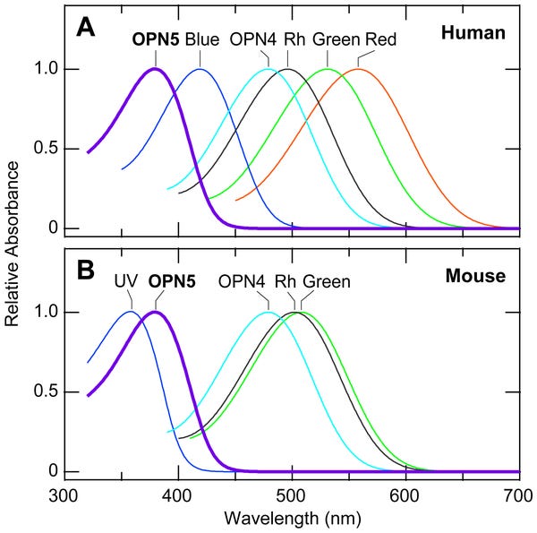
At this stage, I am not yet ready to announce all the details of what I am working on, but I am looking for feedback on a few specific aspects. To give you a bit of a teaser, here is the chart with the curve I have neglected to consider until now. ;) Also, note that the D-Light (safer UVB for vitamin D) is now heavily discounted.
I must give thanks to Dr. Jack Kruse and the recent podcast he did with Rick Rubin (famous music producer) and Dr. Andrew Huberman (Stanford doc with quite a bit of mainstream press). Dr. Kruse actually gave me a shout-out for the ColdBed Pillow we released a couple months ago when Dr. Huberman brought up the importance of a cold sleep environment, and how it would be nice to be able to do that without a complex WiFi based system. Dr. Kruse mentioned that he had told me to make a particular sort of light over a year ago (he had), but now it has finally clicked for me why it matters. But that is not the area where I am looking for feedback…
Sky Portal Re-Design in the Works
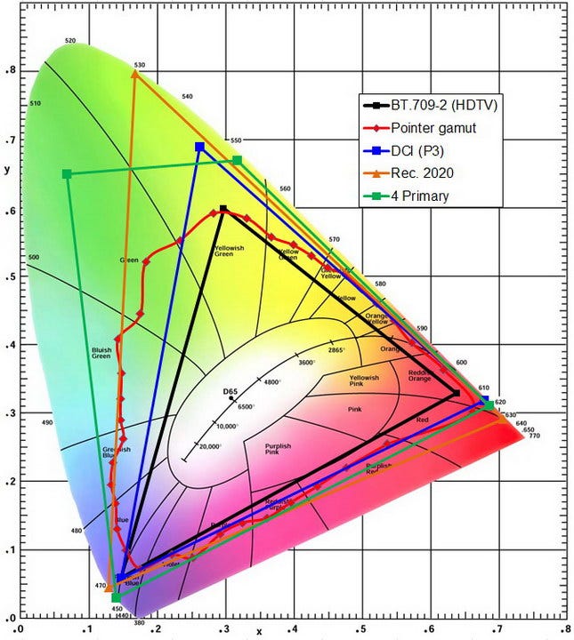
When the Sky Portal came out it was an incredible product, and it still is today, but it is not any better than it was when it launched. I have figured out how to improve the performance quite a bit on multiple fronts, but there is a question that still remains. The new version will likely come in a single variety to reduce confusion (now we have a cyan + white Sky Portal and a cyan + near IR Sky Portal). I have been reading some research papers on color theory, and it turns out, we do not actually have a color theory that correctly maps to reality. To be less abstract while we are talking about light and color, here is an image so you can visualize an RGB color space.
This triangle captures the gamut of colors that can be generated with combinations of three colors located in the corners of the triangle by mixing them in different proportions, with the center point of white representing a fairly even blend.
As you may already know, color is a perceptual phenomena, it is not actually describing any sort of physical reality. With 3 pixels, there is only one way to make a certain color, but when you add more, there are a number of different combinations of intensities at different wavelengths that will make the same color — just imagine two lines that go across different points on the outer edges, say 500nm and 600nm and 460nm and 540nm — it is clear that there is a point where those intersect so different ratios of those wavelengths can make the same exact same color with rather different wavelengths.
Now here’s the problem: you can apply this mathematical model of color theory and expect to get certain outcomes and for various things to behave a certain way, but they don’t. Thornton demonstrated several decades ago (before we even knew all these non-image-forming cells existed in the eye!) that a number of bizzare effects occur. For instance, he found that sometime taking a light that has 3 main spectral components and then removing one of them, which substantially drops the luminosity (whether you measure it by the radiant intensity, photopic luminosity, scotopic luminosity, or any other measure), yet the perceieved brightness substantially jumps up. Color theory says that should never happen. There are also various cases where the perceived colors based on how much each of the red, green, and blue cones of the eye are stimulated are not matching even though color theory says they should match — these effects are persistently found in a number of cases regardless of brightness, indicating that it is not rods that are responsible for the interference.
Anyway, neither color theorists or light designers typically consider the biological effects of the non-image-forming cells in the eyes, which now have well-established biological functions, though of course the pharmaceutical marketing department that sometimes is described by the misnomer of “healthcare & medical industry” neglects how important these effects are. At the research level, all of this is well established.
I am working on the next version of the Sky Portal based on all this information, and as might be clear by now, color has a degree of independence from the wavelengths, and it is the wavelengths that determine the biological response in the factors we care about such as sleep, wakefulness, mood, focus, eye health (or risk of fatigue/damage), and so on. Within the new design, I have flexibility on the color, but to simplify the product, this will not be user-adjustable. We will be dropping the fixation on having a light that excels at illumination from a videography/photography perspective (i.e dropping the ultra high fidelity index we currently have — my sense is not that many people care about this feature, though please hit reply and let me know if it is something that matters to you), which gives us a lot more design flexibility and certain advantages in removing certain spectral components that subtract rather than add value other than for their reflective fidelity. Rather than a chromatic cyan, we will have either a white or near-white appearance. As the RGB color space above shows, moving slightly away from the white point can easily bring us to a very lightly cyan/blue hue, or in another direction, into a very lightly magenta hue (we are not consider any sort of yellow/orange off-white), which brings us to the key question I want user input on (feel free to reply with any additional thoughts, questions, or ideas you have).
Lets Re-Engineer Every Computer Monitor?
Finally, to make the newsletter a bit more interesting, I want to share an idea I have been toying with for the past week, which is the possibility of adding a 4th sub-pixel to displays instead of relying on RGB. Eight years ago someone wrote a nice article arguing for a 4th sub-pixel to expand the color gamut, and this concept should make sense now: you only are able to produce the colos inside the space your pixels enclose.
But all of these people are thinking about it purely from a color perspective, and we know that is not enough. For instance, nightshift software looks terrible if it sufficiently suppresses the blue pixel (and the green one too, which you need if you want to properly block melanopic light as our Carbonshade glasses do) since you basically turn your color space into a narrow sliver of yellow-orange-red, which makes it very difficult to use and navigate a device, or enjoy visual content. With a 4th sub-pixel deep into the violet range instead, and a cyan pixel as well, mostly or completely turning of the cyan pixel still leaves you with a large triangular color space with a wide gamut full of sufficient contrast, all while cutting out a large chunk of the melanopic range that has a half-width going from 440nm to 530nm.
Of course, there are many reasons to not do this. As I previously mentioned, color theory does not quite work, and it just so happens that when you use violet and cyan, it especially does not work — so it is not just 4 sub-pixels, but 4 sub-pixels on hard mode, but that’s the only way I think it can cross the chasm. As the article I linked mentions, you do not have content that is generated for such a large color space, and anything that displays with hyper-saturation, will then deviate from what the creator intended. You only get to properly enjoy it from a color perspective when movies, apps, and tv are made to take advantage of it, and possibly even when cameras have new 4-channel bayer filters instead of just RGB that causes a loss in spectral data about the real world (which as we know from our color theory errors, means you are actually losing color information / fidelity). But if you can get a ton of biological benefits, it is worth doing today, and then the ultra-rich, more pleasant colors just become a bonus.
I think that if I can get some displays like this made, it will cause such a significant “wow” factor in everyone viewing the display (there is data to suggest that chromatic purity of colors is pleasing/exciting, among other factors to the proposed spectrum…) that people will feel compelled to see it move forward. I am engaging with traditional display manufacturers, color theorists, electrical engineers, projector manufacturers, microLED manufacturers to see about getting some of these prototyped. However, I anticipate this might be well outside my budget. If any investors who subscribed to my newsletter want to chat more about this, please reply to this newsletter directly (goes to my email, which is michael at our domain). Given the unique set of factors, challenges, and rationale, I actually have extremely strong IP protection on what I am trying to do here, which means there would be a good opportunity for a partnership / acquisition with major players in this space e.g. a company such as Apple, which likes being ahead of the curve on display tech and would have their thunder stolen when it comes to being the ultimate solution for creatives if we were able to launch something like a 24” 4k monitor using this approach.
Stay tuned — exciting announcements coming over the next few months. I haven’t been this excited about new LED/light products since originally developing the Carbonshades, Sky Portal, and Ironforge years ago!


Hi Michael,
Amazing stuff, thank you for sharing them. I wanted to drop you a line to say that if possible, I'd definitely want to be able to use the Skyportal as a studio light (my plan is to sell my current one, to get the new one when it comes out). But if that doesn't pan out, no problems, I'm still planning to get the new light. May I learn if there is an estimated timeframe when it'll come out? Thank you for helping advance human wellness/happiness. :) Aaron
Hi Michael,
Great post. Please let me know if you have an email which I can reach you at. I have a collaboration inquiry. my email is nathan@itsnowyou.com.
Looking forward to connecting,
Nate